Logo Design
Nok Nok is a strategic design studio that works at the intersection of branding, digital design and content creation. They help brands define their unique story and we use the power of design to accelerate change and fuel growth.
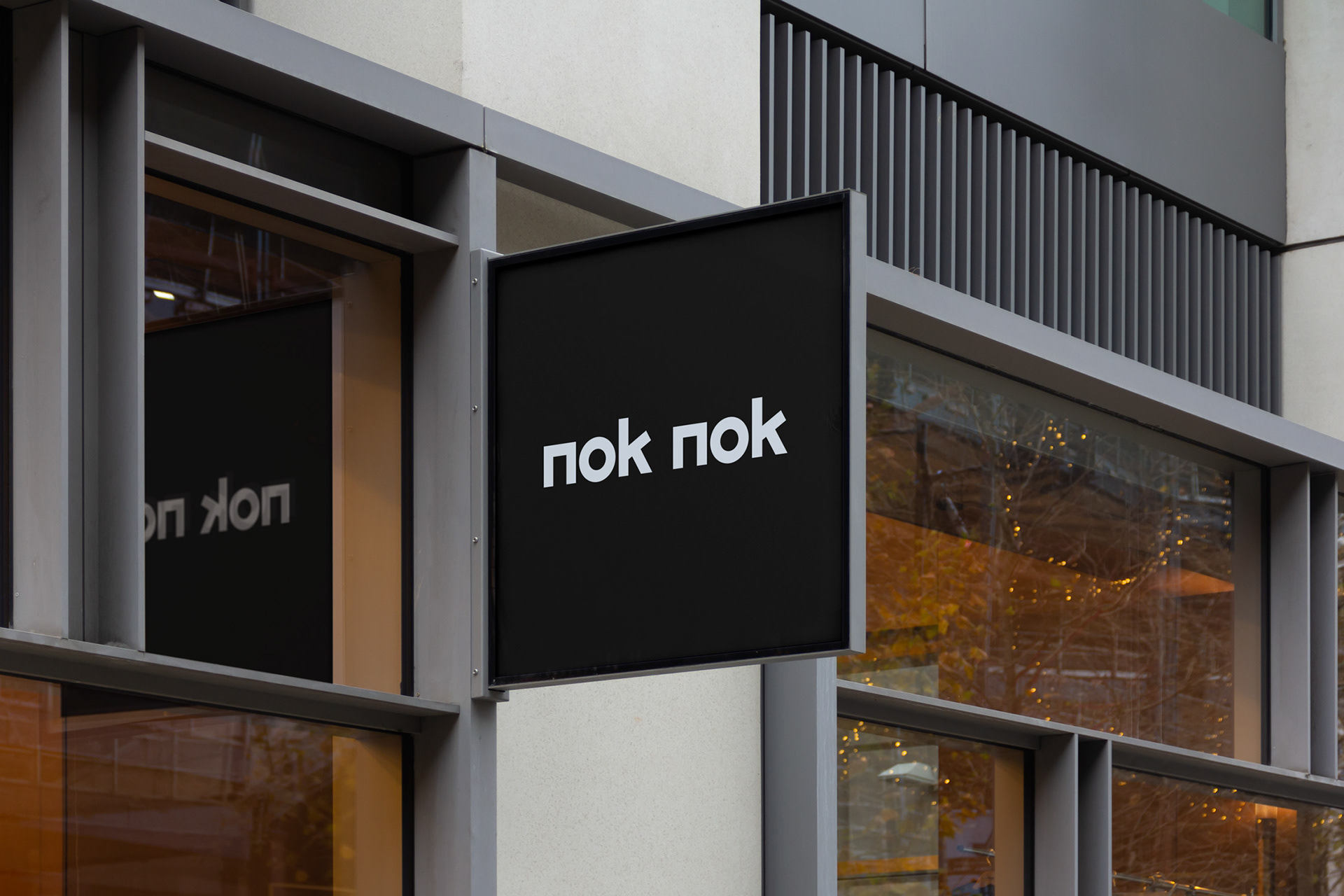
Instead of creating their own logo, Nok Nok asked me to design it for them. My solution was a custom typographic mark that is minimal and geometric, but also full of character. This allowed Nok Nok to show their personality without competing with the work they create for their clients.
The design is loosely based on a knock sound. Clean, short, stern but at the same time warm and round.
Credits
Jeroen Krielaars (Calango) • Logo design


