
Anniversary Identity
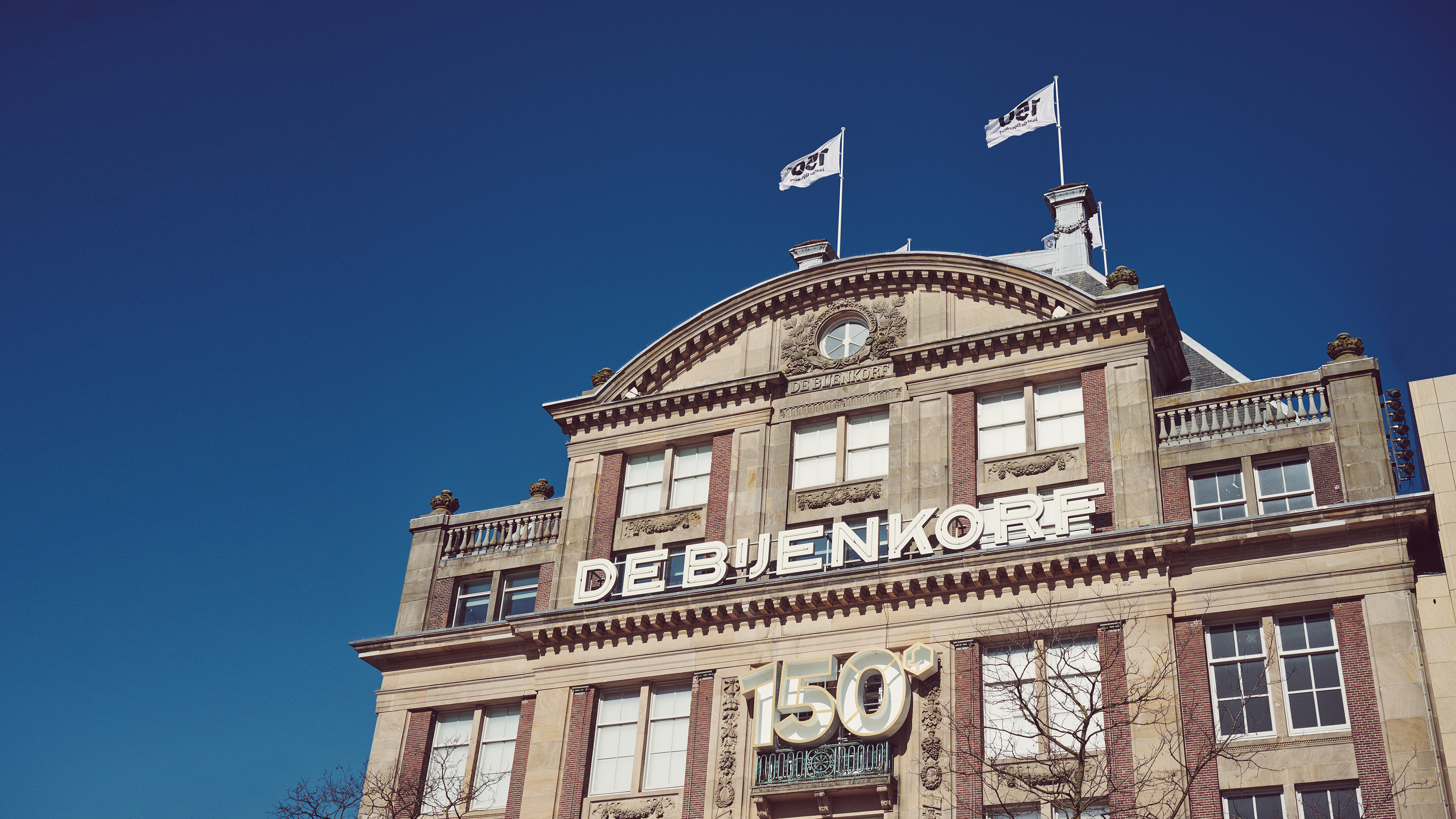
De Bijenkorf, which translates as 'the Beehive' is the biggest and most well known luxury department store in The Netherlands. They have 7 locations across the country with the one Amsterdam being their flagship. They are known for making a luxury shopping experience accessible to a wide audience, and offering a very high level of service.
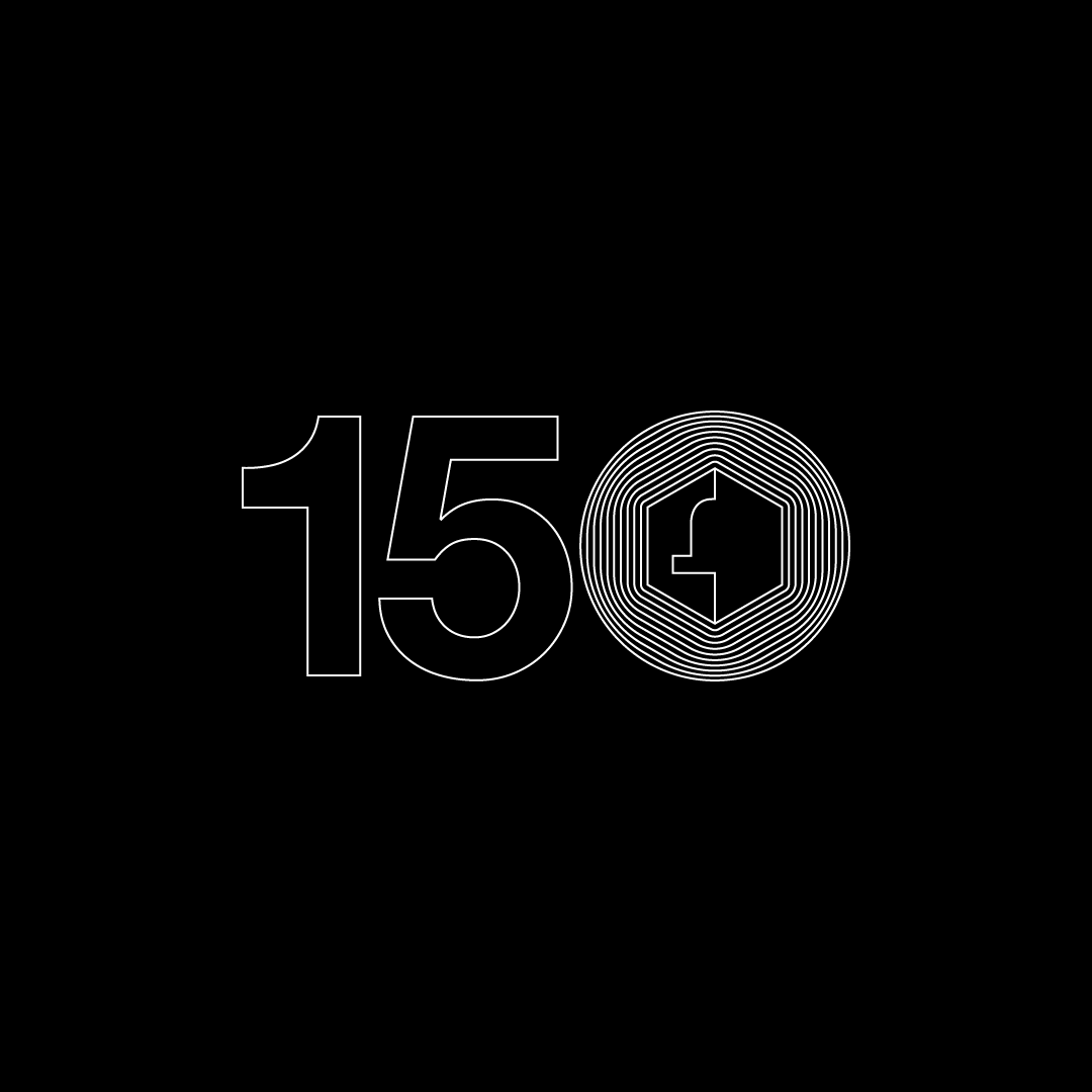
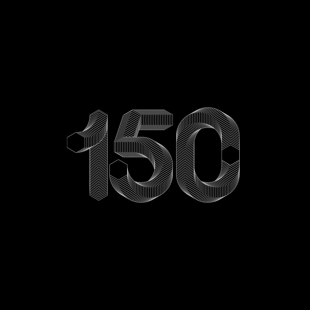
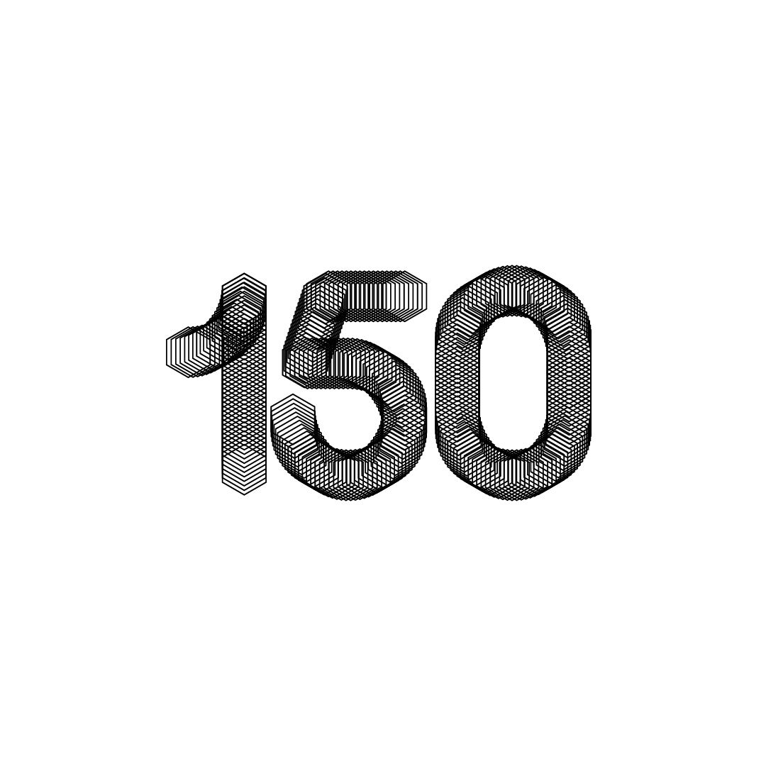
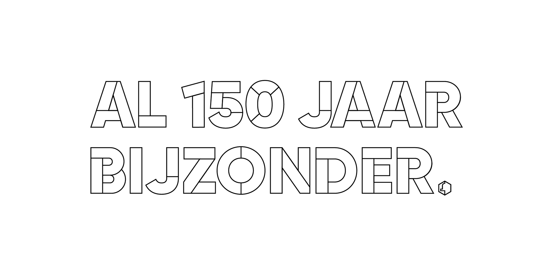
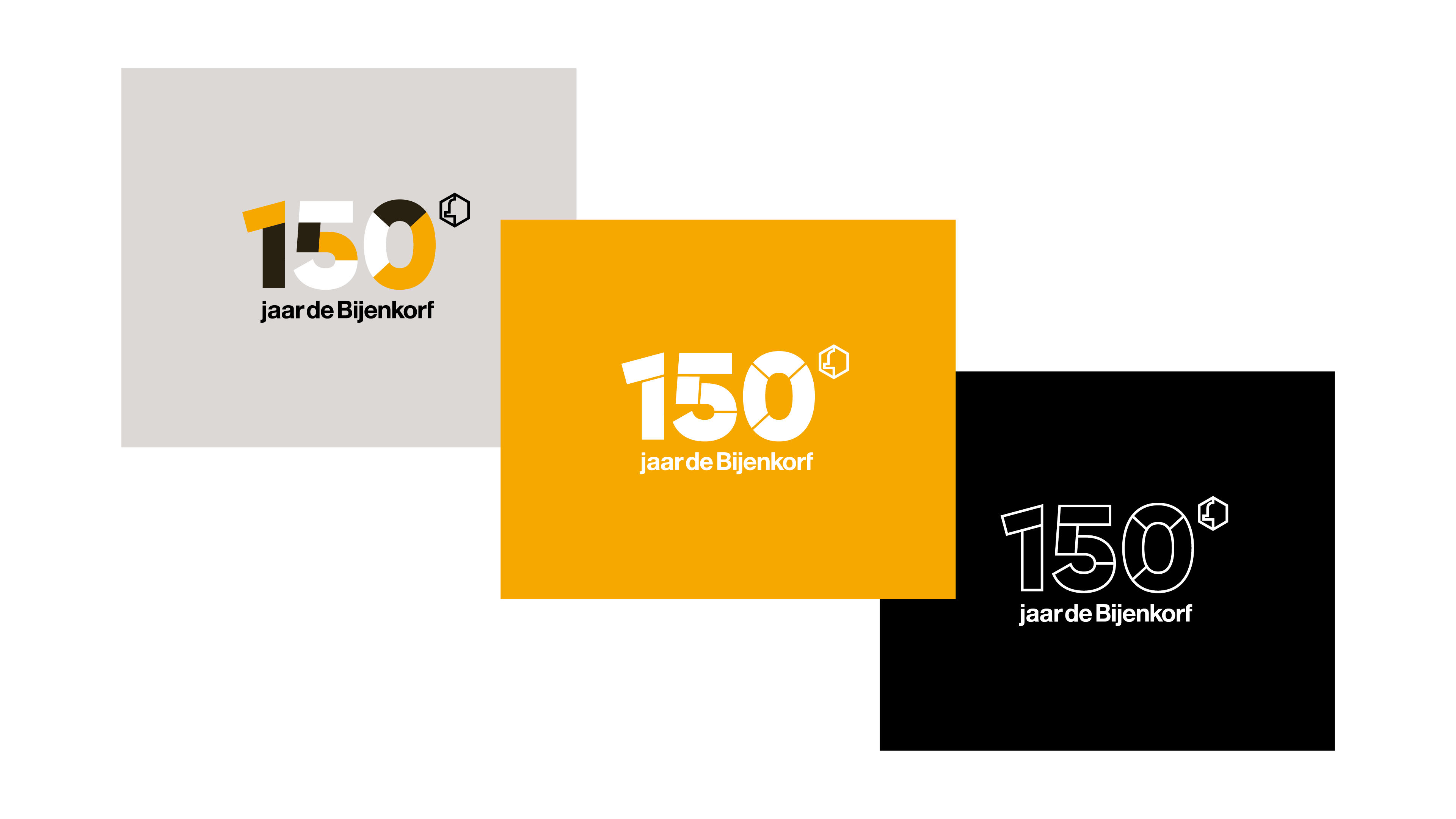
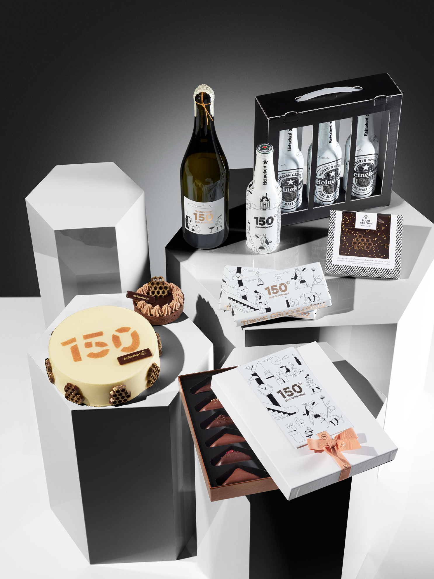
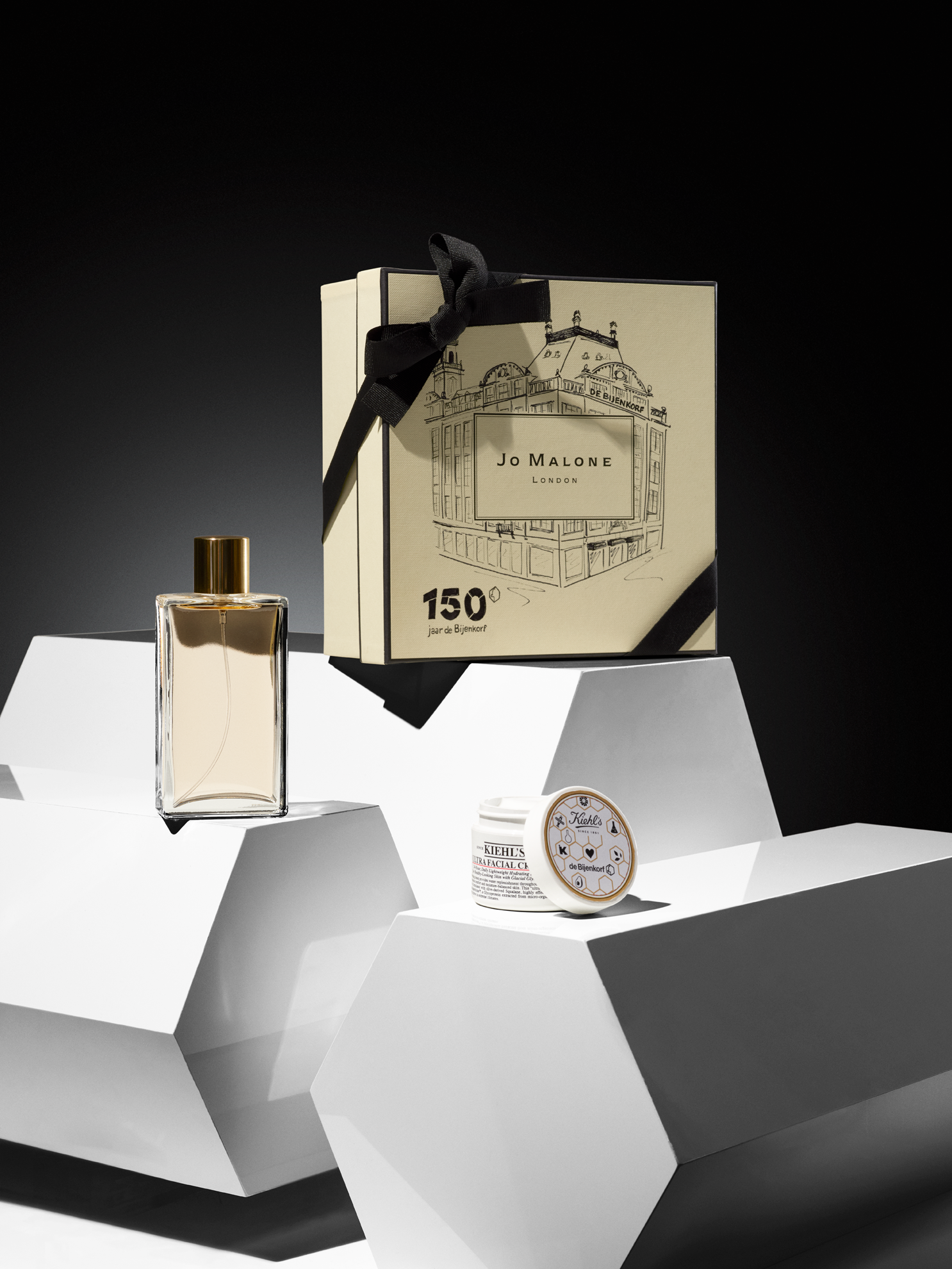
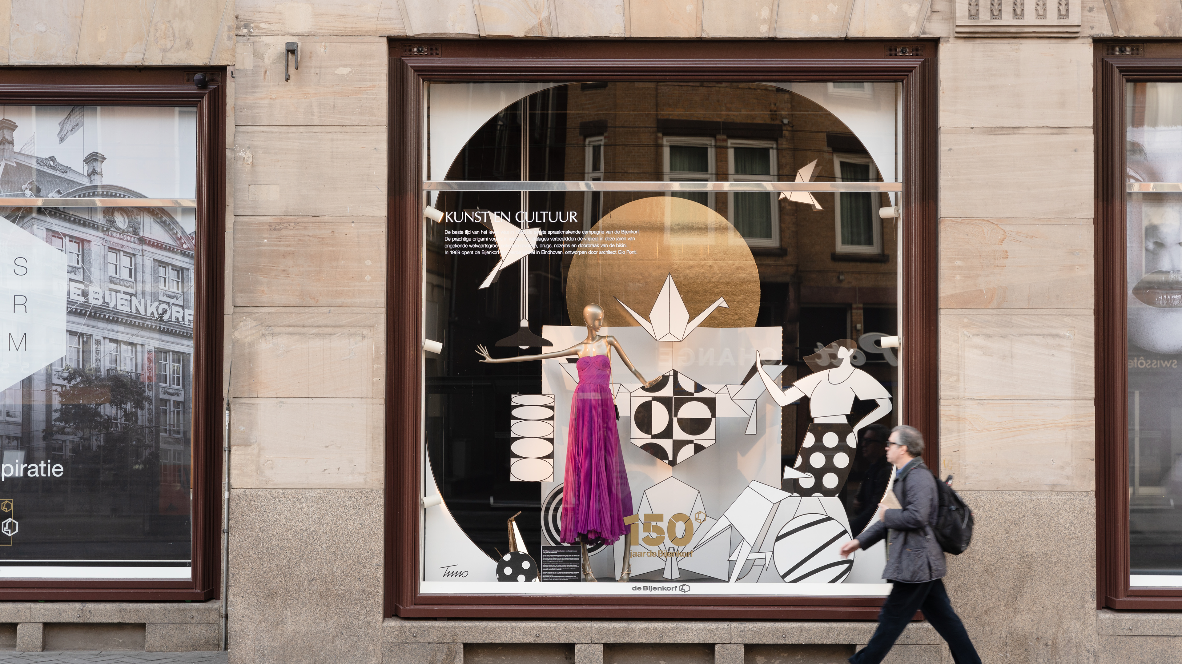
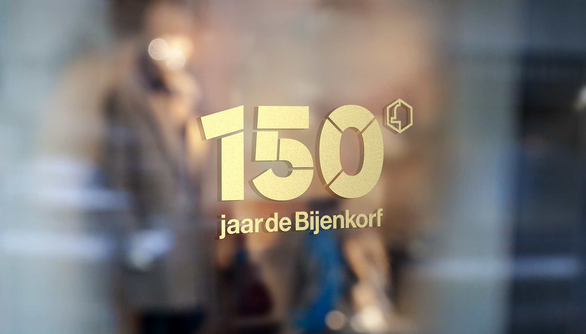
In 2020 they celebrate their 150th anniversary. To underline this very special year, they invited me to design a jubilee mark. A logo, that builds upon their existing identity but gives extra attention to the numbers 150.
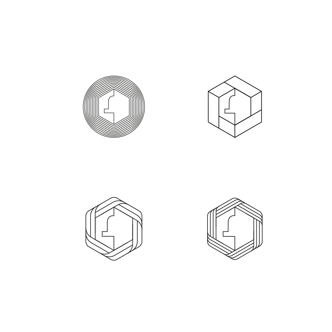
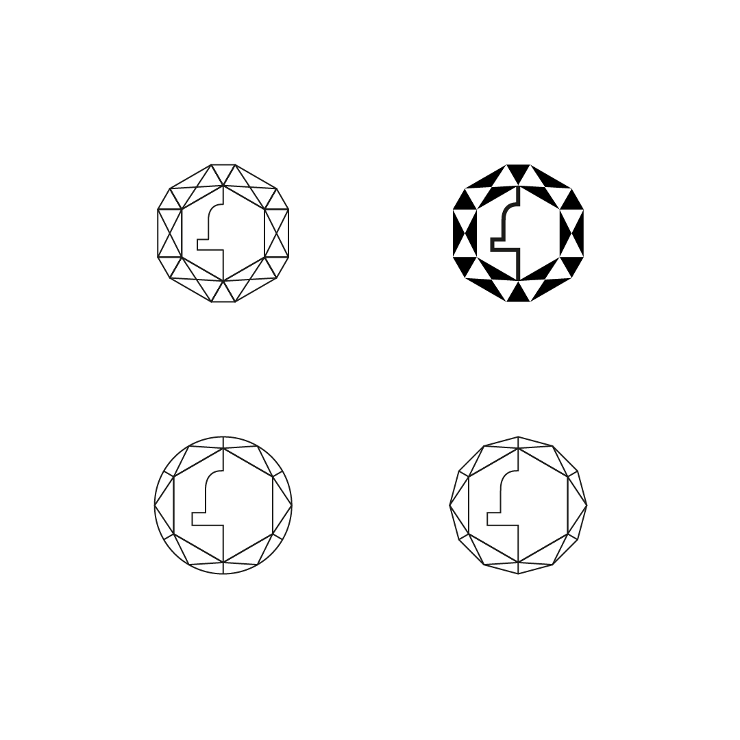
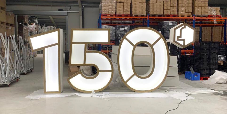
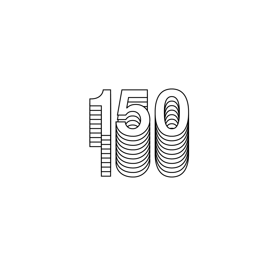
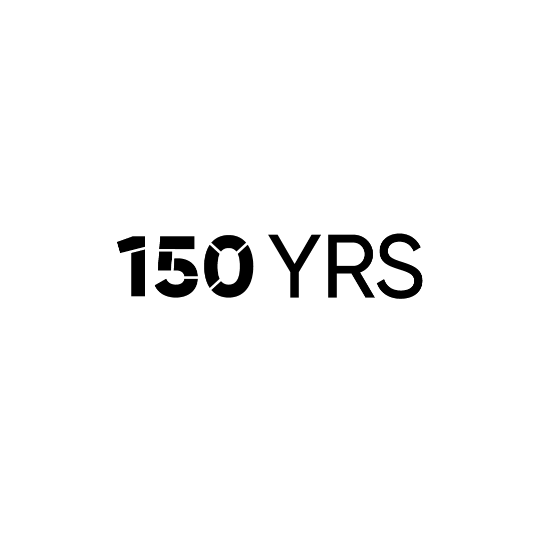
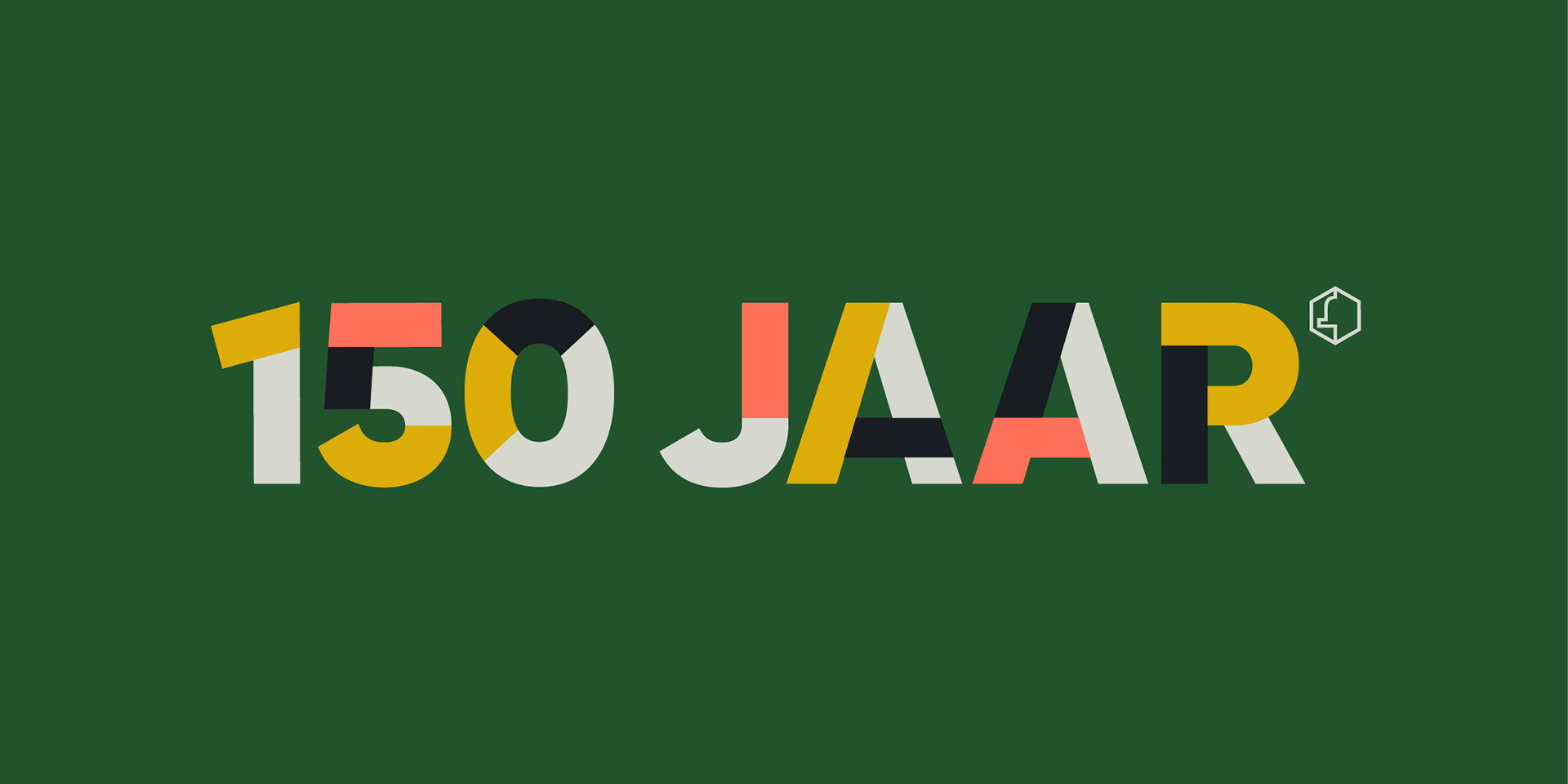
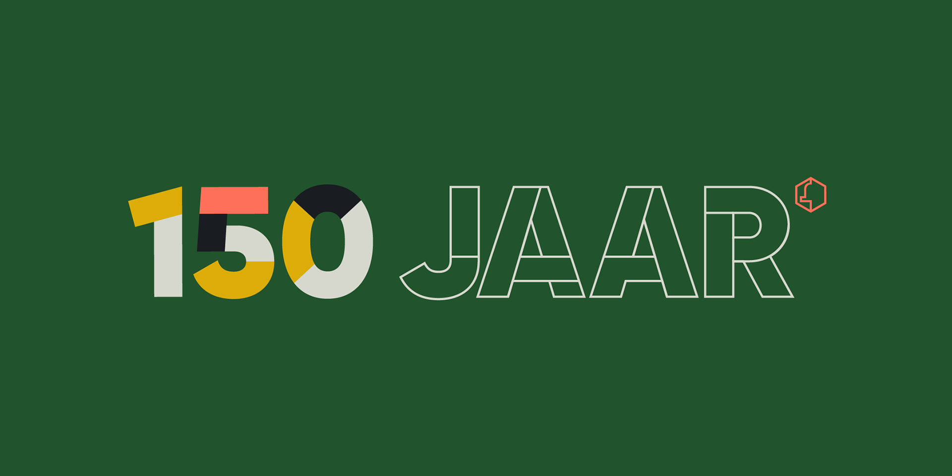
I answered the call with a clean mark that comes in several different forms, to accommodate for a wide range of usages. The basic format stays the same, but comes in a solid, stencil and outlined version. All cut in a way to respect the proportions within the type. The mark can be used with our without the addition of 'jaar de Bijenkorf' (years the Beehive).
The hexagon with a beehive silhouette is an essential part of the original logo and refers to a honeycomb structure. In the jubilee mark it is given a new position and acts as the main point of recognition.
Motion is an integral part of my work, and one of the reasons I've been commissioned for this project. That's why each version of the logo can also animate in or be used as a seamless loop.
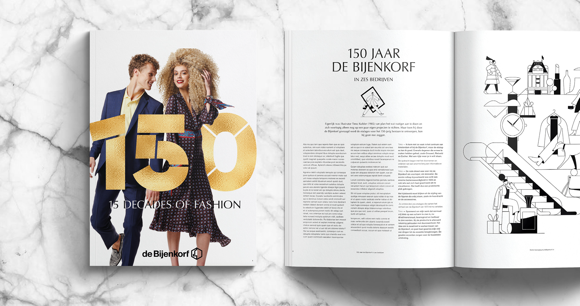
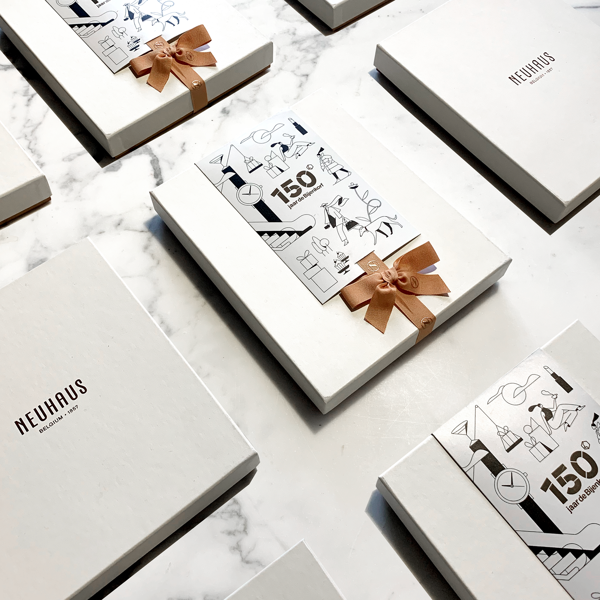
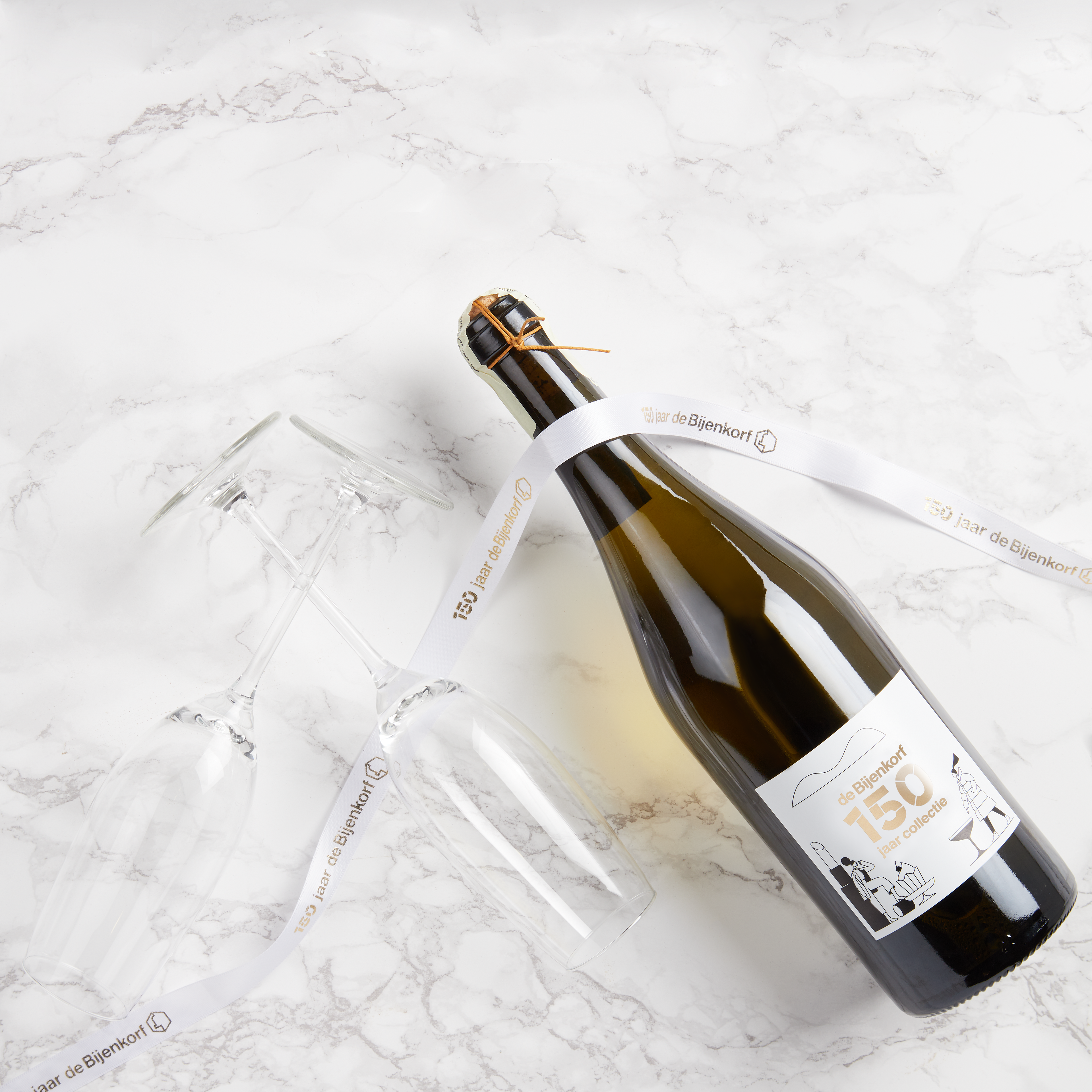
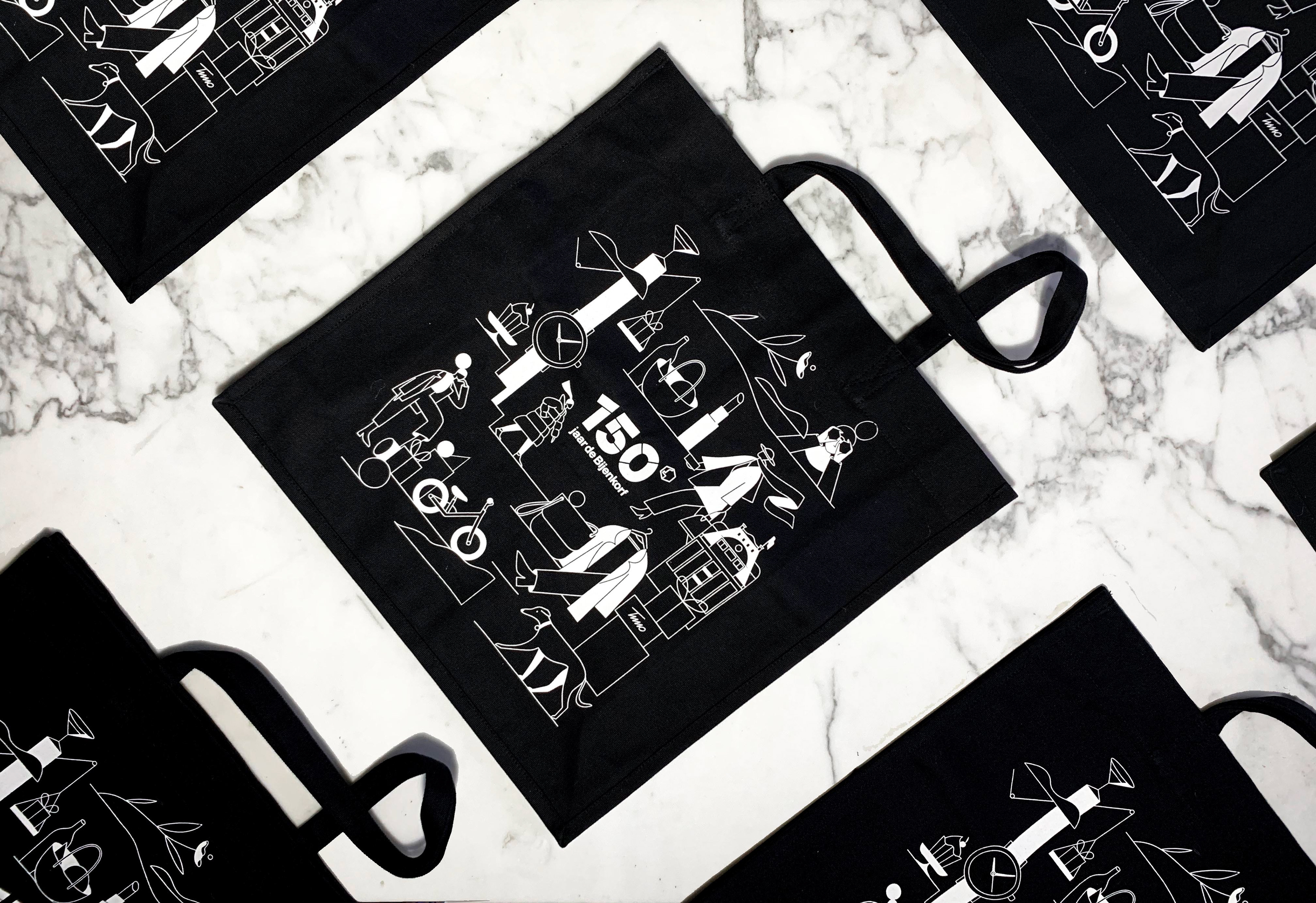
The mark is the leading element for all communication in this special year and is accompanied by illustrations from the renowned illustrator Timo Kuilder.
Credits
Jeroen Krielaars Creative Direction, graphic Design & motion design
Timo Kuilder Illustration
Timo Kuilder Illustration
Graphic Design
↓
Motion Design
↓
In Use
↓
Process
↓